

How I modernized
a software review platform
Employer
Gartner Peer Insights
Services
UI/UX Design
User Research
Timeline
4 Months
Year
2024
Impact / Business Outcomes
• Improved usability of the filters which increased the usage by end-users
• Implemented responsive web design for mobile users
• Increased the conversion rate to the Product Page by over >5% through user-centered design
Gartner Peer Insights: A peer review platform for enterprise level software
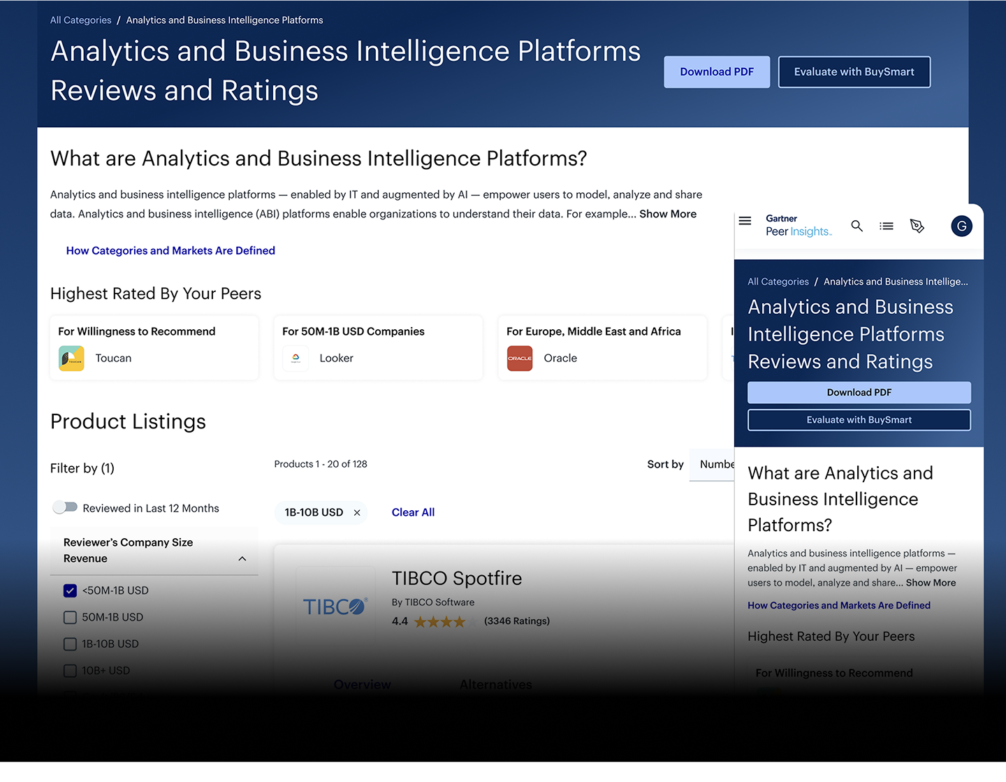
The Gartner Peer Insights Market Page is a core entry point for users researching and reviewing enterprise software. In fact, it’s the most visited page on all of Gartner Peer Insights, averaging over a million visits per month. Despite high traffic, the page struggled with an outdated interface, difficult filter interactions, and limited mobile usability. My role was to lead the redesign to address these friction points and improve the overall user experience.
Identifying the areas of improvement
Several pain points emerged through stakeholder feedback and user data:
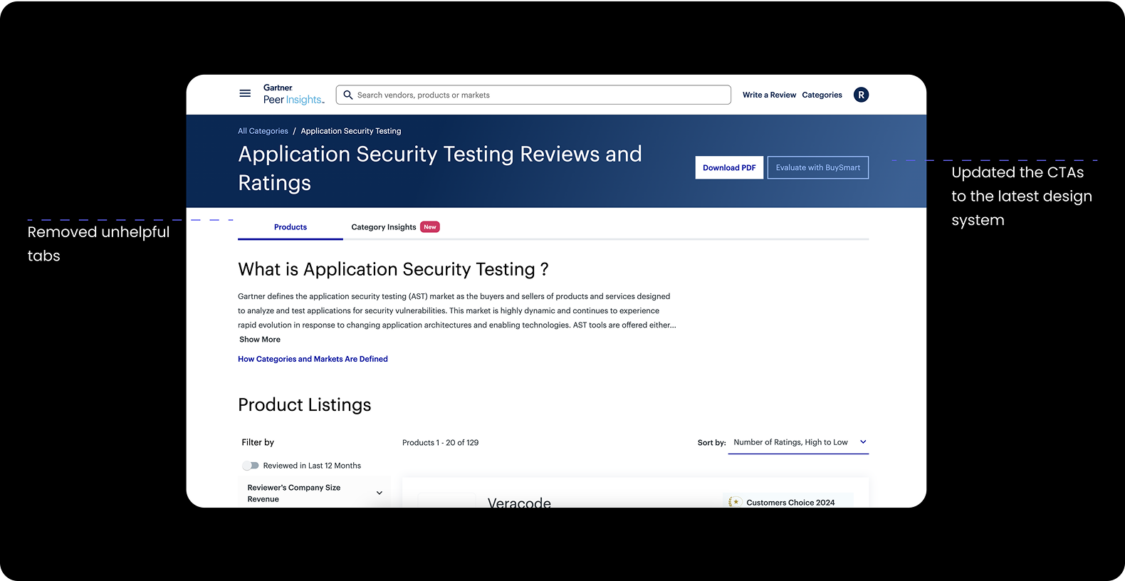
• The interface lacked visual hierarchy and felt outdated.
• Filters were clunky and hard to navigate, especially on mobile.
• The page was not responsive, making mobile access frustrating.
• Key components—such as calls-to-action and product cards—were underperforming and not converting users to deeper pages.
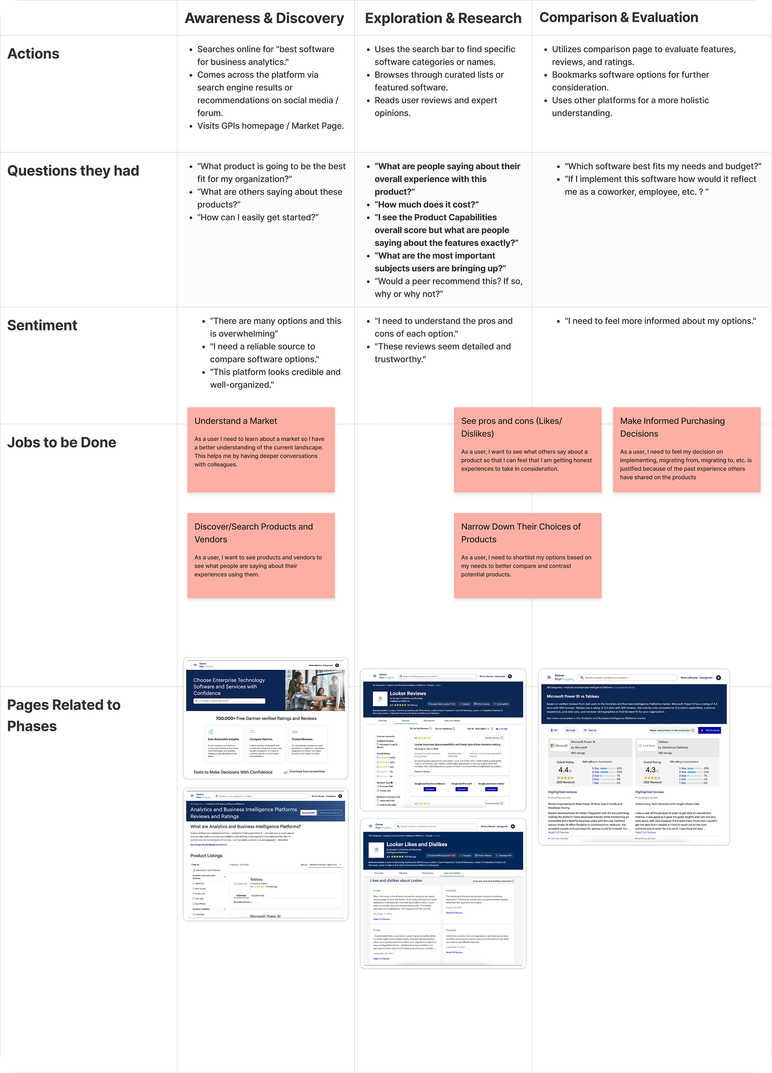
Creating a comprehensive user journey along with their Jobs-To-Be-Done
I found it was helpful to map out the journey of a user and understand how do the current pages serve them and exactly what are they achieving?
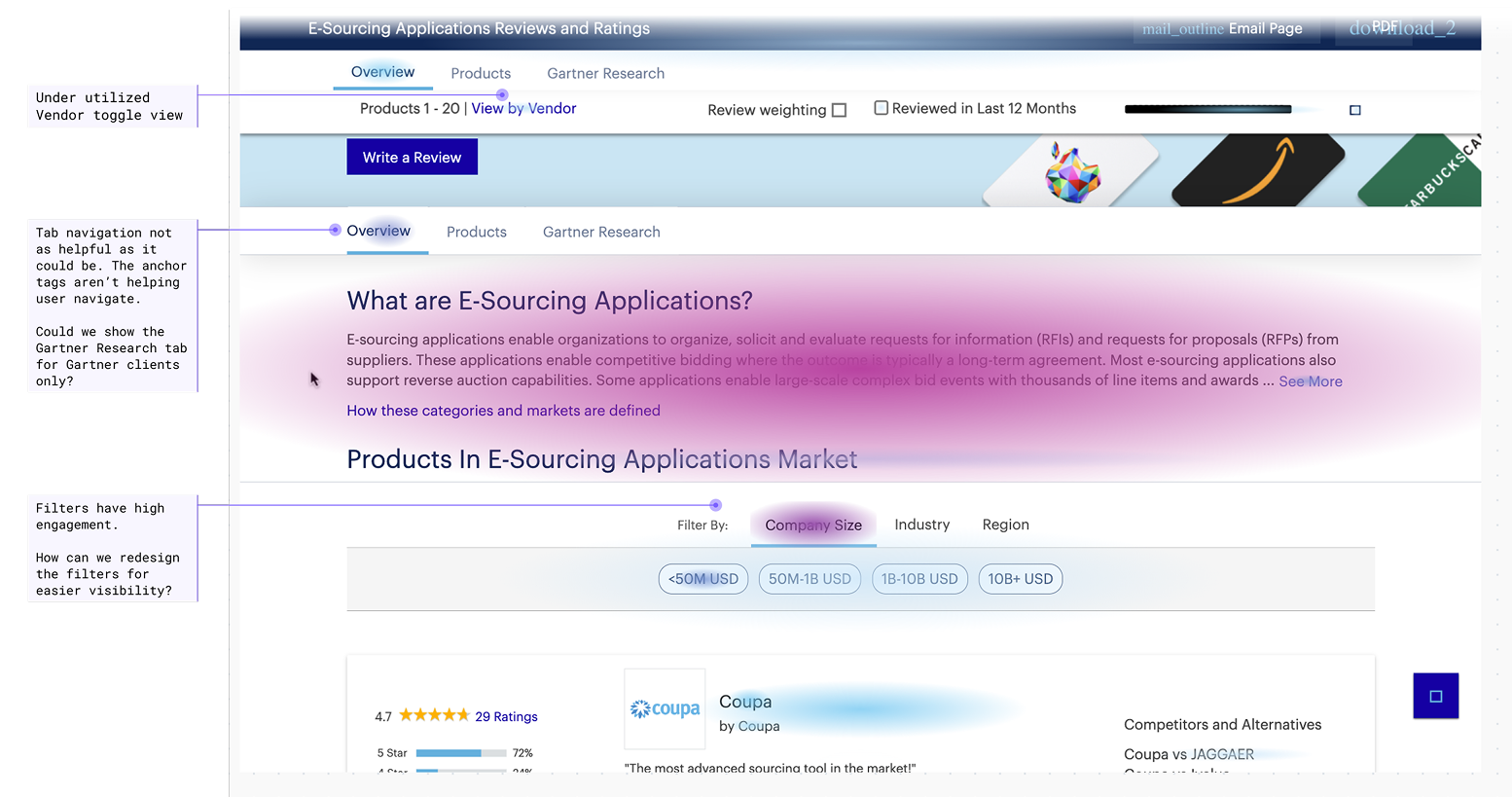
Looking to Fullstory for understanding
Our behavioral analysis tool “Fullstory” was able to tell us how users were interacting on the existing page through heatmapping. It was clear that the “View by Vendor” toggle was underutilized, the tab navigation was unhelpful, and the filters weren’t as visible as they ought to be.
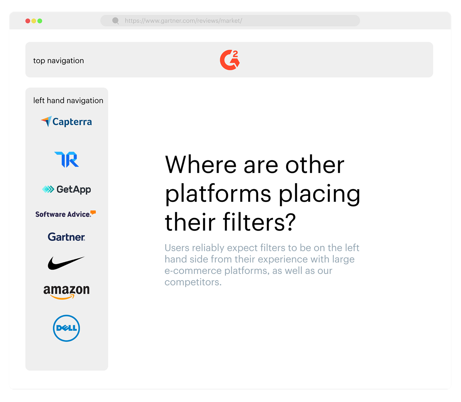
Conducting secondary research helped me wrap my mind around filter placement
I looked to several large platforms, and competitors, to see where they are placing their filters. It was easy to see that when implementing several filters they seem to scale much better when placed in the left hand side of the screen versus the top of the screen. I used this to start crafting some designs.
After doing my research I felt confident to start designing some concepts for the Market Page
A side by side comparison of the old desktop filters versus the new ones
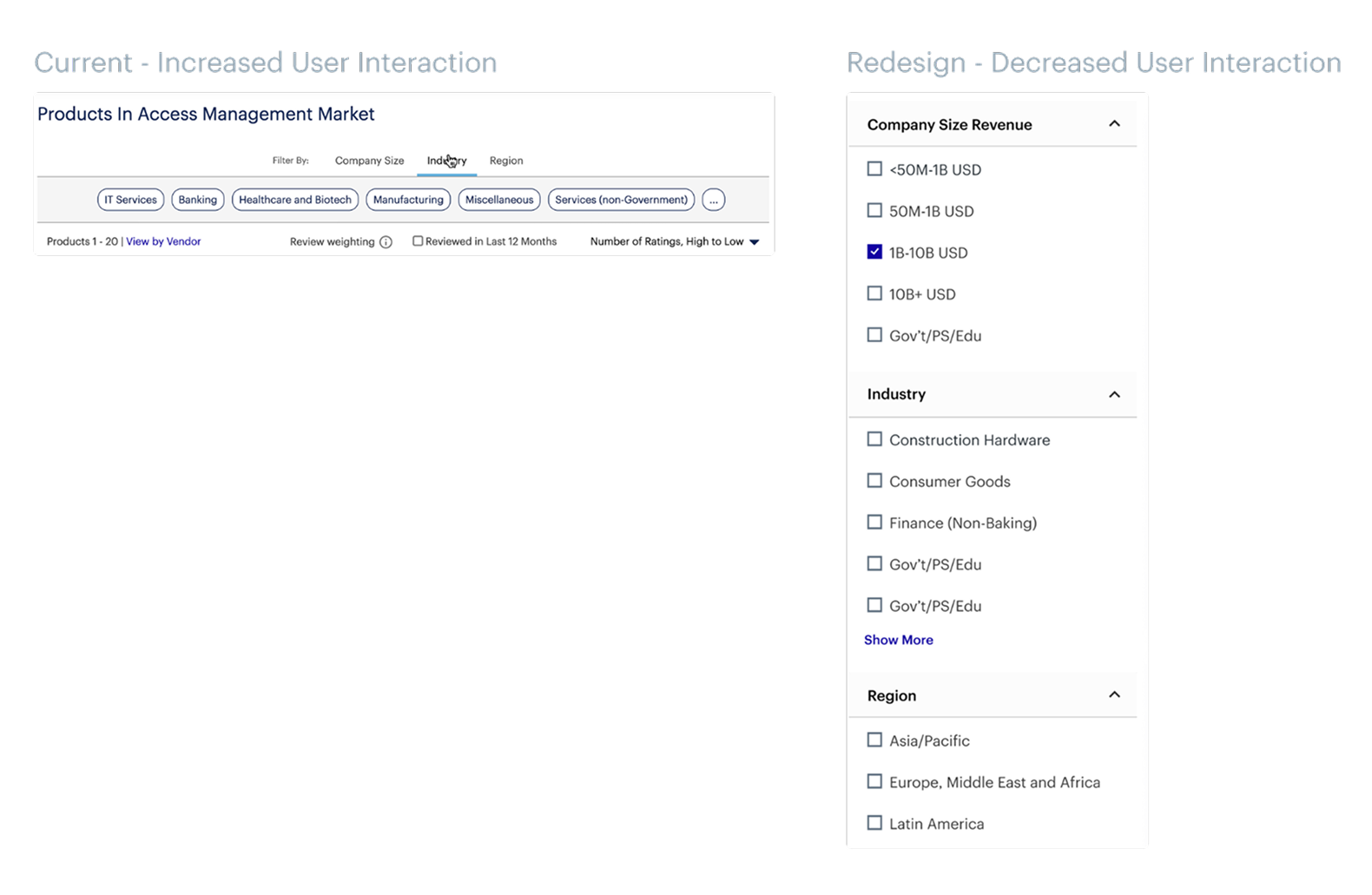
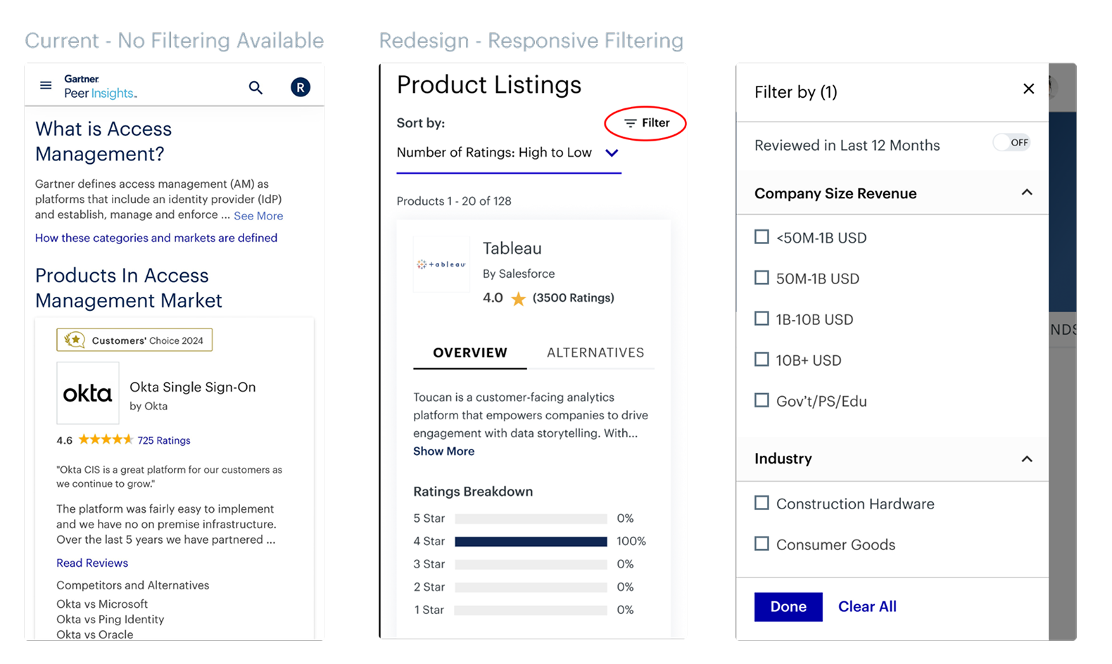
I was amazed to discover that the filters would simply vanish on mobile devices. This was something I made sure to address in the redesign.
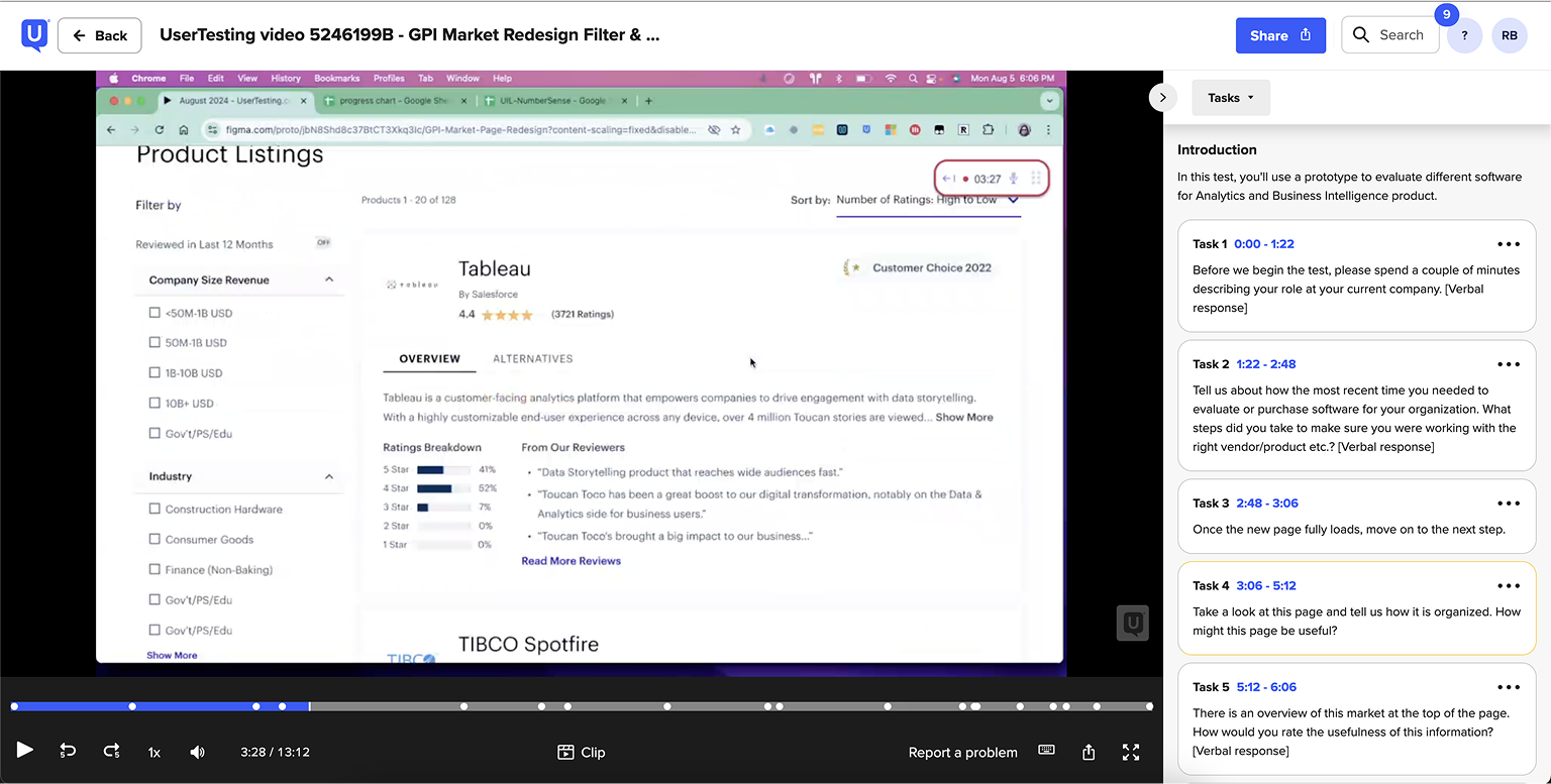
After the designs were ready it was time to get user feedback
Using usertesting.com I wanted to test multiple aspects of the designs. The main being the new filtering experience.
Tested Tasks:
• Were users able to clearly understand all of their options and easily apply multiple filters to see the content they want to see?
• Did the content on the cards provide enough information to want to explore more?
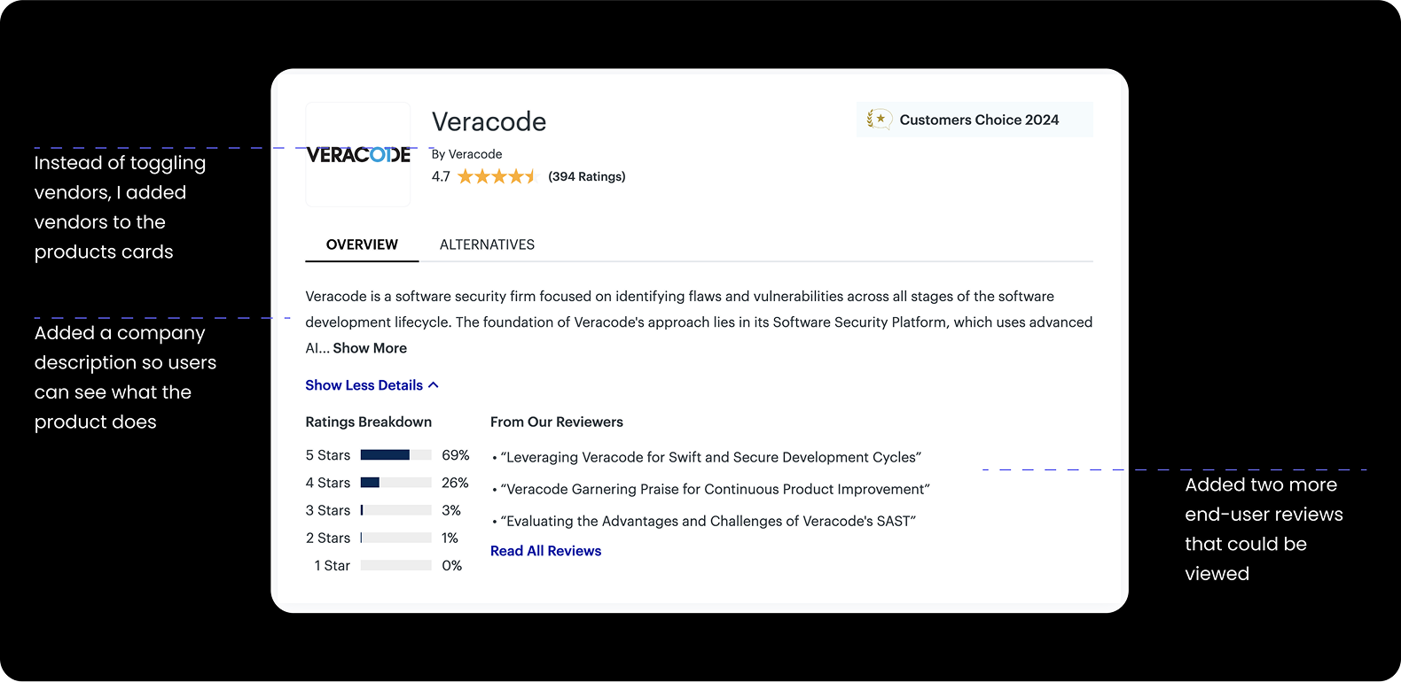
• By adding the Vendors directly on the card, would users understand they could navigate to the Vendor detail page?
Key findings from the moderated user testing
I found that the filters were clearly understood by users, that the Market page cards showed enough information to want to explore more, and that having vendors as links on the cards were also intuitive. Huge wins!
Another one of the key findings from the user interviews was that users found the “market overview” (that is the description of what the markets is) not as useful as we originally intended. We found that there was an easy explanation for this too. When experts come to this page looking for software, they would have already looked into what the market is. Especially, if they were the ones in charge of finding a new software product.
Design Impact:
• This is some text inWe decided to shorten the market description but keep the “Show More” button clearly visible for end users. This way users can still access the description but we can prioritize the most important content: the products!side of a div block.
The end result: An easier way to find reviews on products that folks care about
This project took several months and countless hours of collaboration as well as many design iterations. I was happy with all of the hard work paying off. And the redesign definitely led to measurable improvements including:
• Increased Filter Usage: Users engaged more frequently and effectively with the filtering system.
• Higher Conversion Rates: More users clicked through to Product and Vendor Pages.
• Mobile Usability Boost: FullStory showed longer session times and deeper scrolling behavior on mobile devices.
Check out these
other projects


© Copyright 2025 | Design & Developed By Barrett Designs LLC