How I Designed
a collaborative debate tree
.png)
Client
Steelman Network
Services
UI/UX Design
Brand Identity
Timeline
1 Month
Year
2024
A little bit of background
I was approached by Alex and David, two young entrepreneurs with a goal of changing how people debate online with the goal of letting people put their money where their mouth is. That’s right. A platform where people can wager real money for proving their point.
David and Alex wanted Steelman Network to be a community driven platform designed for online debates, where users can post claims (which are essentially ‘hot takes’ that welcome other user’s to challenge them), as well as challenge other claims, and act as jurors to judge debate outcomes.
David and Alex aimed to foster rational discourse, reliable fact-checking, assist academic research, resolve conflicts, and provide a platform for honest and bold individuals.
At the beginning of the project, they showed me a skeleton of a website, so they needed someone to come in and help them with user experience design as well as the overall user interface. The catch was they had a tight timeline, due to their budget, and we had to design the platform within 4 weeks!
So, what is a debate exactly?
When I first got started, I didn’t know anything about debates. Or the landscape of debate platforms. My first course of action of was to understand how debates work (scoring, structure, etc.) and then to research other debate platforms.
What I found was very interesting. Most platforms were academia focused. This mean’t there was a gap in providing a gamified experience for audiences who were no longer involved in school.

Identifying the user need of the debate platform
I remember speaking with Alex and David, showing them my findings. I found most of the platforms were clunky and had weak branding that could make it less attractive to younger audiences. They agreed that the industry has opportunity to have a new bold user experience that drives the competitive spirt. The best way I can describe it is they wanted to do what PrizePicks (a popular gambling app) did to the fantasy sports industry. In case, you’ve never heard of them, they gamified the sports gambling world as well as focused on a simplified UX!
After making sure David, Alex, and I were on the same page about the user need of introducing a simplified UX of debates, we then got started on creating a sitemap to organize the websites’ structure and to help plan design.
After making sure David, Alex, and I were on the same page about the user need of introducing a simplified UX of debates, we then got started on creating a sitemap to organize the websites’ structure and to help plan design.

Visualizing the debate tree: The biggest challenge of designing this platform
How can users visually represent the debate and the interaction with the other debater?
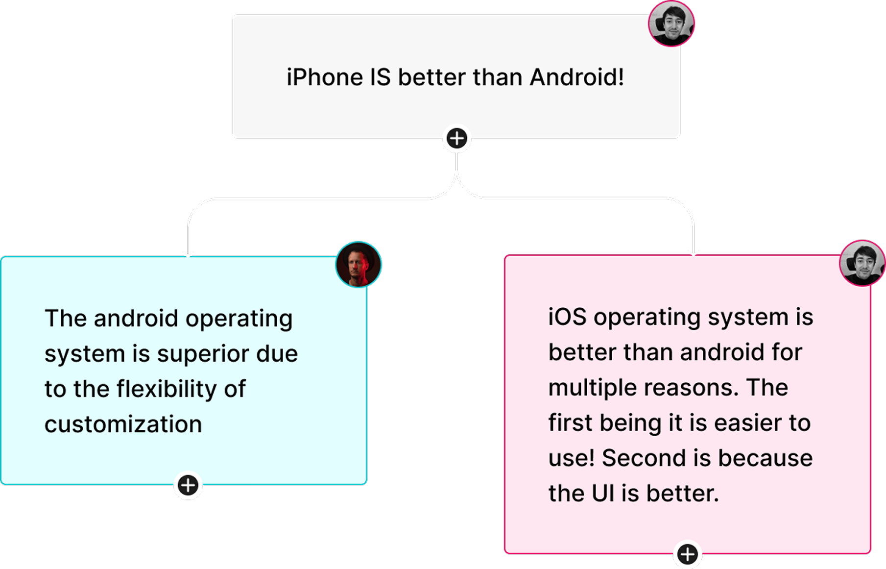
This question gave birth to the debate tree. A tree (node) structure allows for a visual way of representing a debate and enables debaters to engage per conversation point. This is where the fun comes in. Each debater would then be able to add their points on the previous rebuttal.

How can users add multiple “child” debate nodes to the “parent” debate node and know they are related?
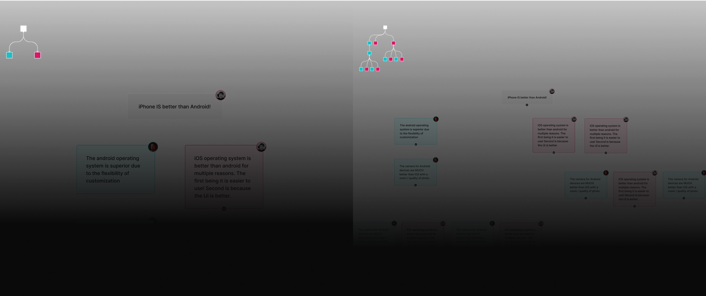
I had to reiterate my original design because the “Add” button on the node would disappear after a child node has been attached to it. The “Add” button needed to stay but also make sure to accommodate for the new child node that was going to be attached to it.
The spacing in the child nodes had to adjust responsively and keep in mind that it had to visually connect to the parent node. I also had to keep in mind when these debates get larger there needed to be a way for the user to know where they were in the debate tree.
(Depicted below) A minimap in the top left corner ensured the users knew where they were, aligning with best practices for wayfinding.

How can users add comments, as well as media, to a debate node?
By making these cards interactive, I designed it where users would be able to add comments to a related debate node by simply clicking on the card. Again, I took inspiration from Figma’s interactions that allows users to add comments and other sources of media through a hovering comment card.

Keeping the comments out of sight but accessible was the goal
This allowed for easy organization and removed the need to have a UI component at the bottom of the screen for commenting. There would be a comment count to show if comments have been added. The comment box would be named the debate node and display the user who posted it.
This comment box also allowed the audience/jurors to comment on the debate node. Their comment boxes would be displayed as grey to show they were not on a particular side.
This comment box also allowed the audience/jurors to comment on the debate node. Their comment boxes would be displayed as grey to show they were not on a particular side.


Wrapping it all up
Given the tight timeline we were unable to fit user testing into the 4-week sprint. However, I did tell David and Alex that it would be crucial to test the flow of the debate as well as ensuring users understood how they can interact with the debate tree. I’m looking forward to seeing how users engage with each other through the debate tree and potentially making design iterations.
A special thanks to David and Alex for trusting me with their startup idea.
A special thanks to David and Alex for trusting me with their startup idea.


