

How I Improved
Real Time Insights for Waste Disposal Companies

Client
SitePro
Services
UI/UX Design
User Research
Timeline
4 Months
Year
2023
Impact / Business Outcomes
- Improved mobile app usability / functionality leading to a 20% increase in downloads within six months of release
- With the launch of the Google Play Store Android App, it resulted in an increase of more than 15% in Net Promotor Score, thus increasing customer retention.
- Improvements enhanced the app’s effectiveness as a sales tool, driving a +10% increase in revenue.
- Provided SitePro their first design system with WCAG AA compliant components
Background
When companies drill for oil, they are often left with waste that they need to dispose of responsibly. These companies look to saltwater disposal facilities to help dispose of their waste.

Operators running these saltwater facilities are often having to work back-breaking 80-hour weeks. While their skills are best suited for maintenance and overseeing complex operations, they are often sacrificing their precious time by driving across vast regions to check for any repairs in person.
This is where SitePro comes in and saves these Operators a whole lot of headaches.
SitePro installs IoT devices on these facilities that enable remote monitoring and management software to see what these pumps, sensors, valves, etc. are doing. They also enable automation so less human attention is required on site, thus saving these Operators hours of time traveling to each location.
SitePro knew it needed to re-evaluate their mobile app as a customer value proposition and rethink how they can better assist their customers with monitoring and managing their business operations on-the-go. I partnered with SitePro as their first User Experience Designer, so I had to ensure to educate the product team on how UX design works and fits into the product development workflow.
SitePro knew it needed to re-evaluate their mobile app as a customer value proposition and rethink how they can better assist their customers with monitoring and managing their business operations on-the-go. I partnered with SitePro as their first User Experience Designer, so I had to ensure to educate the product team on how UX design works and fits into the product development workflow.

Identifying the pain points within the Mobile App
While in the discovery phase of the project, I found Operators struggled with inefficient workflows in the mobile app like creating/searching for tickets, as well as lacking critical real-time data insights. The previous mobile app was only available for iOS, so this project was also about widening to the Android user base.
Building out the “Jobs-To-Be-Done” Diagram helped me wrap my head around the day-to-day of a Operator
I wanted to know what it was like to be a Operator in the oilfield. What did they do everyday? What are some of their painpoints?
My main findings: When they’re operating multiple SWD facilities, they want to monitor systems, perform maintenance, and communicate critical updates efficiently, so they can maximize uptime, ensure safety, and support optimal oil recovery.
They make sure these facilities don’t stop running!
My main findings: When they’re operating multiple SWD facilities, they want to monitor systems, perform maintenance, and communicate critical updates efficiently, so they can maximize uptime, ensure safety, and support optimal oil recovery.
They make sure these facilities don’t stop running!

I wanted to meet with these Operators in person but busy schedules made it difficult to access them directly.
Like I mentioned, they work 80+ hours a week! Instead, I relied on insights from the account management team members, who served as proxies for user feedback. While meeting with Operators would have been more ideal, these account managers often were former Operators and supported Operators day in and day out. Not to mention they were much more willing to meet and review the Mobile designs!
“Yeah, generally we don’t need a graph like that to check on our meters. I want to see what it’s doing now”
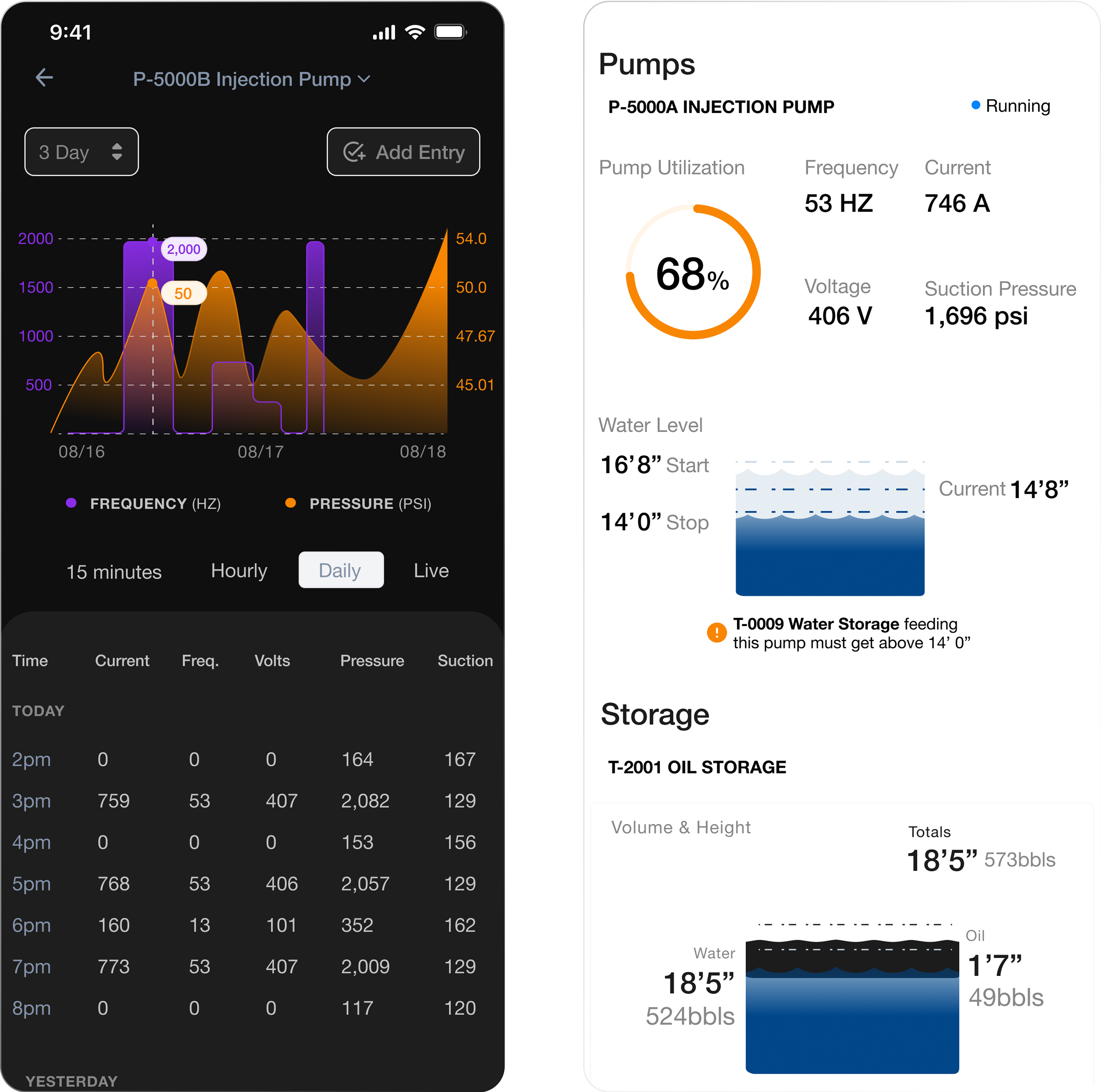
I was able to validate designs with the account managers acting as proxy operators. One example, was how I designed a real time data graph to pair with Meter logging data with the understanding this would improve data comprehension. However, I found that when users are viewing meters they don’t find historical data visualization particularly valuable because of the need of immediate data and not comparison within time that the graph was providing. Therefore, this graph was ultimately reimagined to be simpler. The below design represents that collaboration.

Key User Need - Operators need real-time data to make decisions on which site needs their attention at any given point in time.
When managing dozens of locations, you can imagine how important prioritization becomes!
One example, was how I designed a real time data graph to pair with Pump logging data with the understanding this would improve data comprehension. However I found that when users are viewing pumps they don’t find data visualization particularly valuable because of the need of immediate data feedback and not comparison within time that the graph was providing. Therefore, this graph was ultimately removed.
One example, was how I designed a real time data graph to pair with Pump logging data with the understanding this would improve data comprehension. However I found that when users are viewing pumps they don’t find data visualization particularly valuable because of the need of immediate data feedback and not comparison within time that the graph was providing. Therefore, this graph was ultimately removed.
%201.png)
Determining what data ought to be in the mobile platform vs. reserved for the desktop view.
With dozens of graphs / data visuals, we had to determine what were the most important for a user to see when viewing the mobile app.
How I was able to overcome this: I met with senior leadership to review Jobs-To-Be-Done by these Operators to find out what was important for them “on-the-go” versus what data was reserved for desktop use. The largest design challenge was compressing complex data into a meaningful actionable way for Operators.
How I was able to overcome this: I met with senior leadership to review Jobs-To-Be-Done by these Operators to find out what was important for them “on-the-go” versus what data was reserved for desktop use. The largest design challenge was compressing complex data into a meaningful actionable way for Operators.

Process
To better understand user workflows, I conducted limited interviews with operators managing saltwater disposal facilities. One operator shared how they monitor key data points, such as pump efficiency and prioritization of high-activity locations. These insights directly informed the following design solutions:
Live Insights / Data Visualization: Implemented real-time data visualization alongside historical data to ensure operators could act quickly.
Datafeed for Locations: Created a feature allowing users to prioritize critical locations, configure notifications, and view a live news feed of activities.
Through iterative prototyping and validation with customer service teams acting as proxy users, these solutions were refined to meet operator needs effectively.
Main issues fixed
- Ticketing system lacked visual hierarchy meaning users had difficulty scanning tickets for the most important information
- Site data was sectioned out and didn’t allow for a quick way to view the most important data. A lot of what Pumpers care about is what is this equipment doing today? How is it different from yesterday? And do I need to act on this data now?
- Data visualization for water levels and their relationship to the oil in it. Operators need a quick way to visualize the process allowing better comprehension of the equipment’s status.
- Improving the security cameras layout as well as communication of notifications.
Check out these
other projects


© Copyright 2025 | Design & Developed By Barrett Designs LLC